Best Practices for Landing Page Design in 2025

Best Practices for Landing Page Design in 2025
Your landing page has one job: get someone from “what is this?” to “I want in.” And it has to do that in under 10 seconds.
Whether it’s for a campaign, a product launch, or a service offer, a landing page is like a handshake. It has to be clear, intentional, and leave a good impression. In my work with startups and creative brands, I’ve tested dozens of landing formats—and here’s what I’ve learned.
What Works (and What Doesn’t)
📍 DO: Lead with a strong message. Not your name. Not a vague slogan. A real reason to care.
❌ DON’T: Overload with info. Landings are not your brand story—they’re a hook.
📍 DO: Use scroll to structure attention. One core idea per screen section.
❌ DON’T: Stack too many CTAs. One clear action beats five options.
📍 DO: Design for mobile first. Think thumb, not mouse.
❌ DON’T: Assume visual = conversion. Hierarchy matters more than gradients.
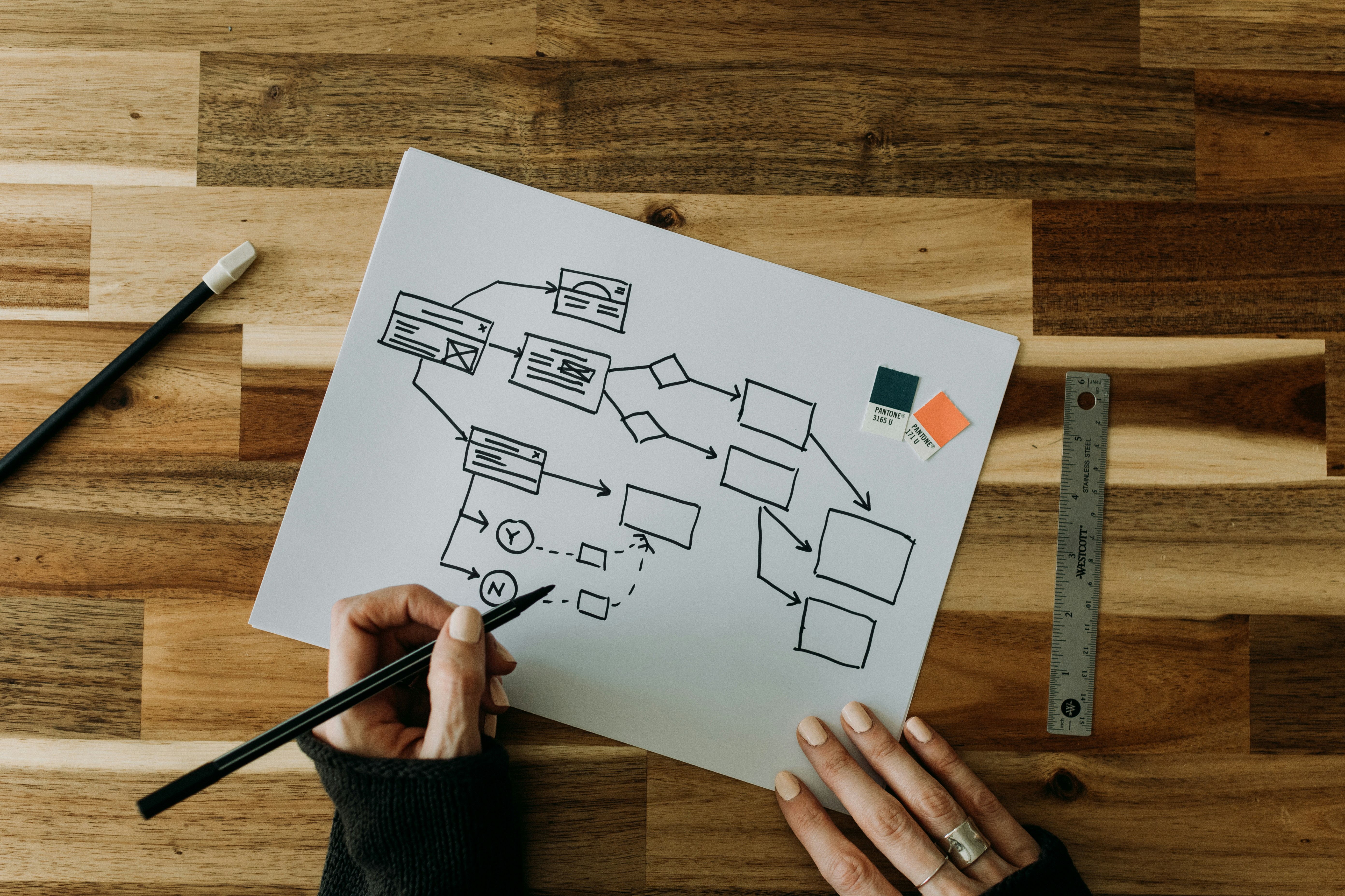
Anatomy of a Great Landing
From the top down:
Hero section with intent – A clear headline, a short subheadline, and one strong CTA. It should immediately answer: Is this for me?
Quick value proof – Benefits, trust signals, social proof. Show you’re legit—fast.
Product or offer demo – A short video, interactive preview, or carousel. Help them imagine the product in action.
Transformation section – Break down what will happen after they say yes. Use 3–5 simple steps to guide them through the experience. Help them visualize where they’re going and how easy it is to get there.
CTA again, now with more context – Reinforce the action once they’ve learned more.
Optional – FAQs, reassurance points, contact or support info.
That’s it. Everything else? Cut or test.
Example from the Field
When we designed a landing page for a digital service targeted at non-technical users, we noticed high drop-off on the first scroll. Why? The language was too technical. We rewrote the entire page using everyday terms, added a short “How it works” animation, and moved testimonials higher.
Sometimes, it’s not the design—it’s the story you’re telling.
Conclusion
A landing page is not a brochure—it’s a guided experience. And in 2025, users expect it to be fast, clear, and personal. The best ones don’t feel like sales—they feel like clarity.
A landing doesn’t need to be fancy.
It needs to make people feel ready to say yes.